Branding - Dyor
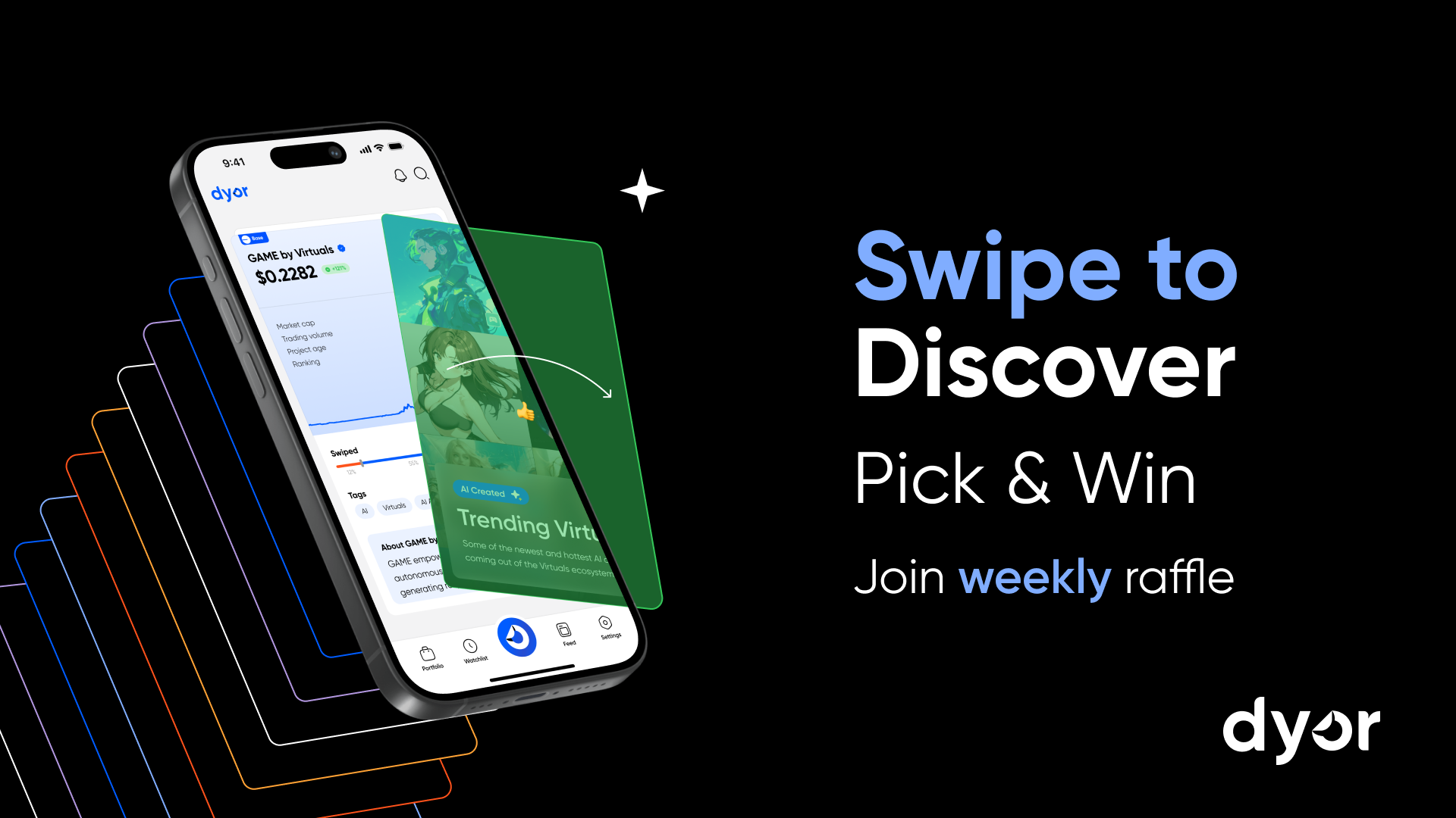
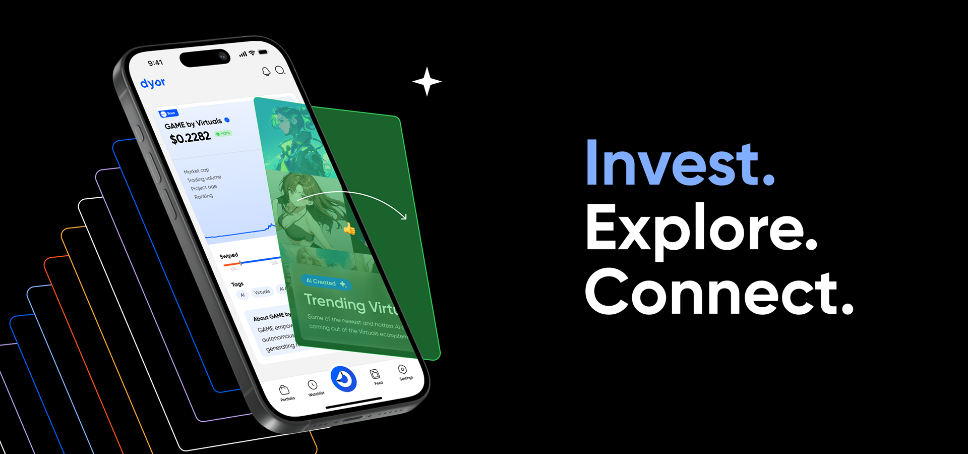
Dyor is a decentralized investment app with an intuitive swipe interface and gamified features that make it easy to discover and invest in top projects. With a focus on user-friendly design and AI-curated content, Dyor empowers beginners to confidently make their first onchain investment.
Task
Create a full visual identity for the brand, including logo redesign, color palette, illustration style, and a distinct AI feature icon. The key goal was to deliver a clean, tech-forward, and memorable look that reflects the product’s core values: simplicity, accessibility, and innovation.
Role
Illustration
Motion design
Graphic design
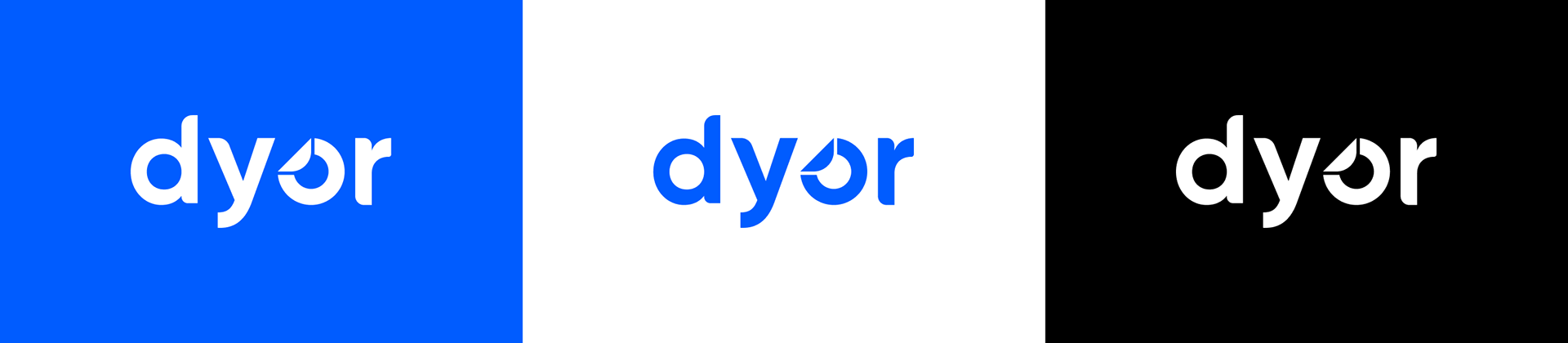
Logo
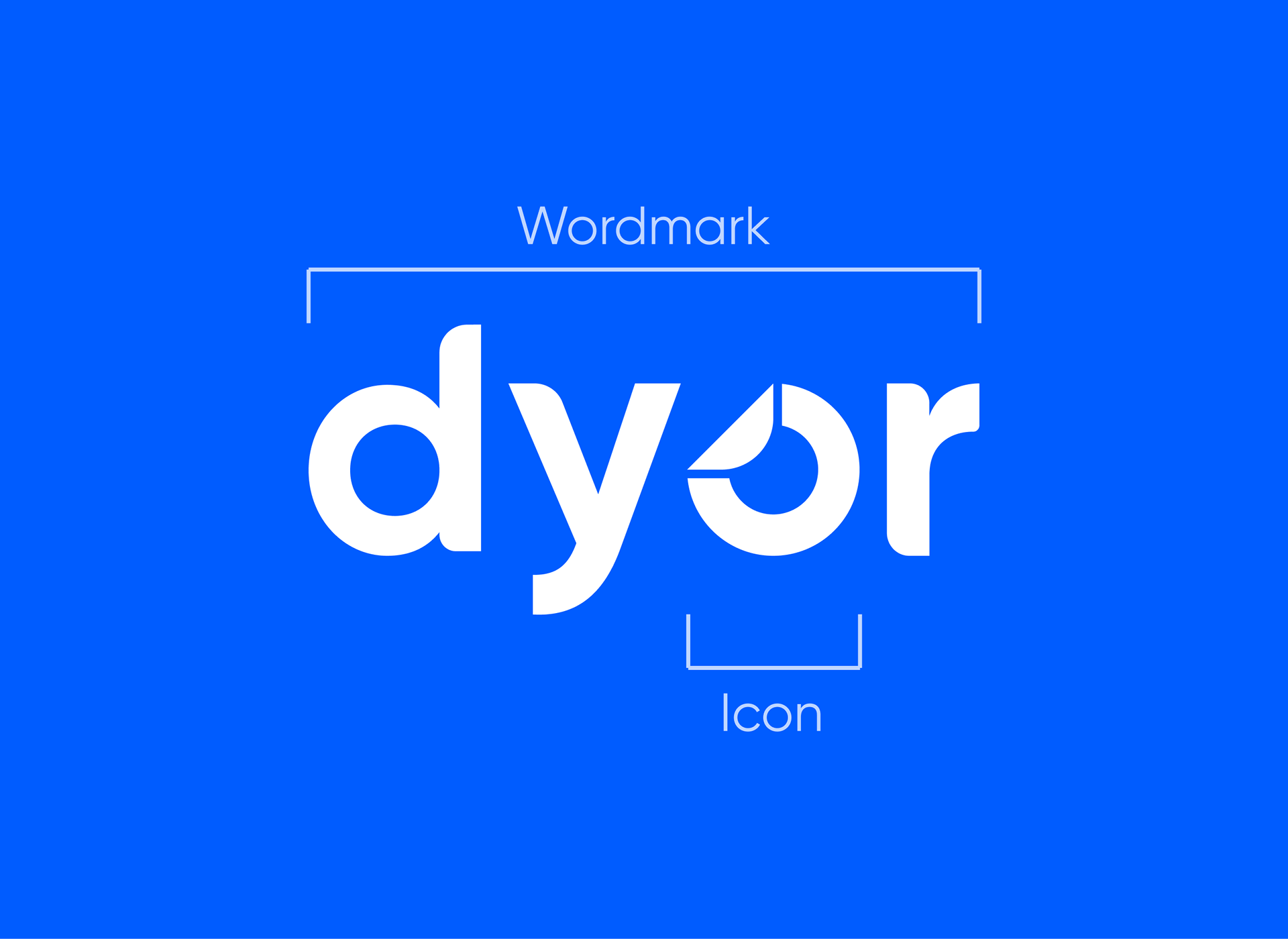
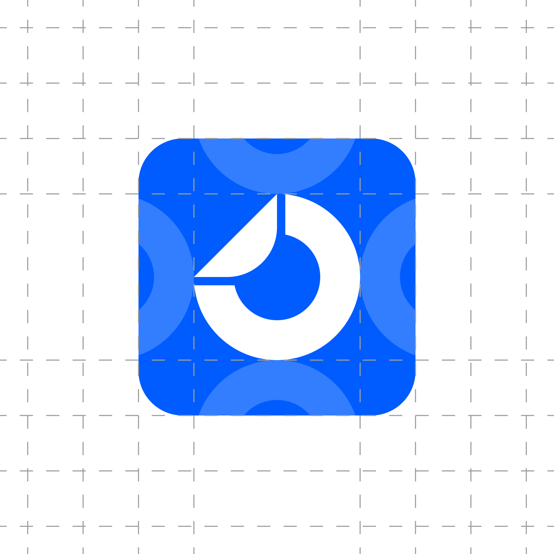
The goal was to redesign the logo with a cleaner, more functional approach. The previous version relied on shadows that often caused issues in practical use. I simplified the icon: the folded corner and the “O” are now separated by negative space. This kept the original concept while improving readability and adaptability across platforms.


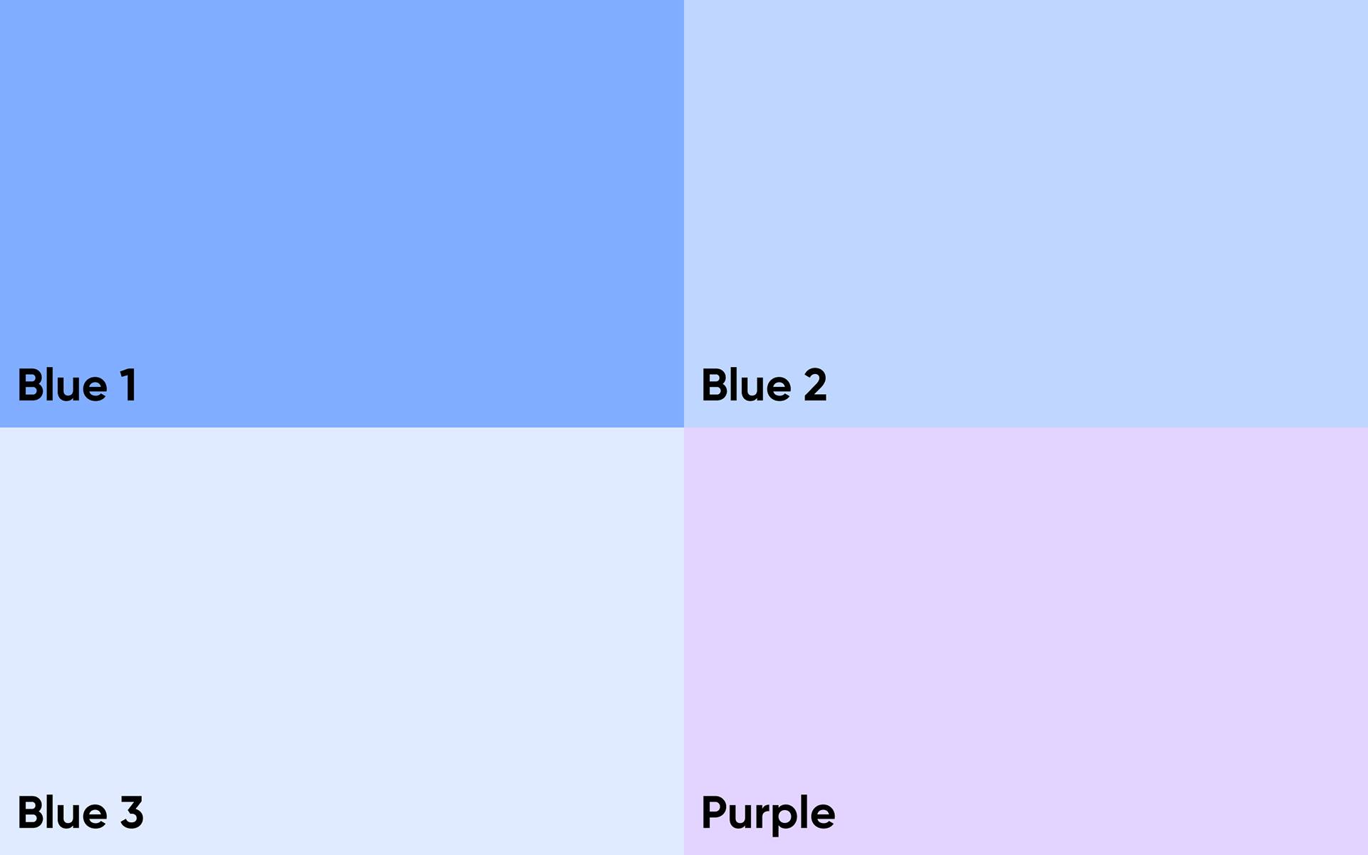
Color Palette
The core color palette is based on black, white, and a signature blue, which became the brand’s primary accent. These foundational colors were expanded into a full system, including secondary and background shades for use across UI, illustration, and communication design.

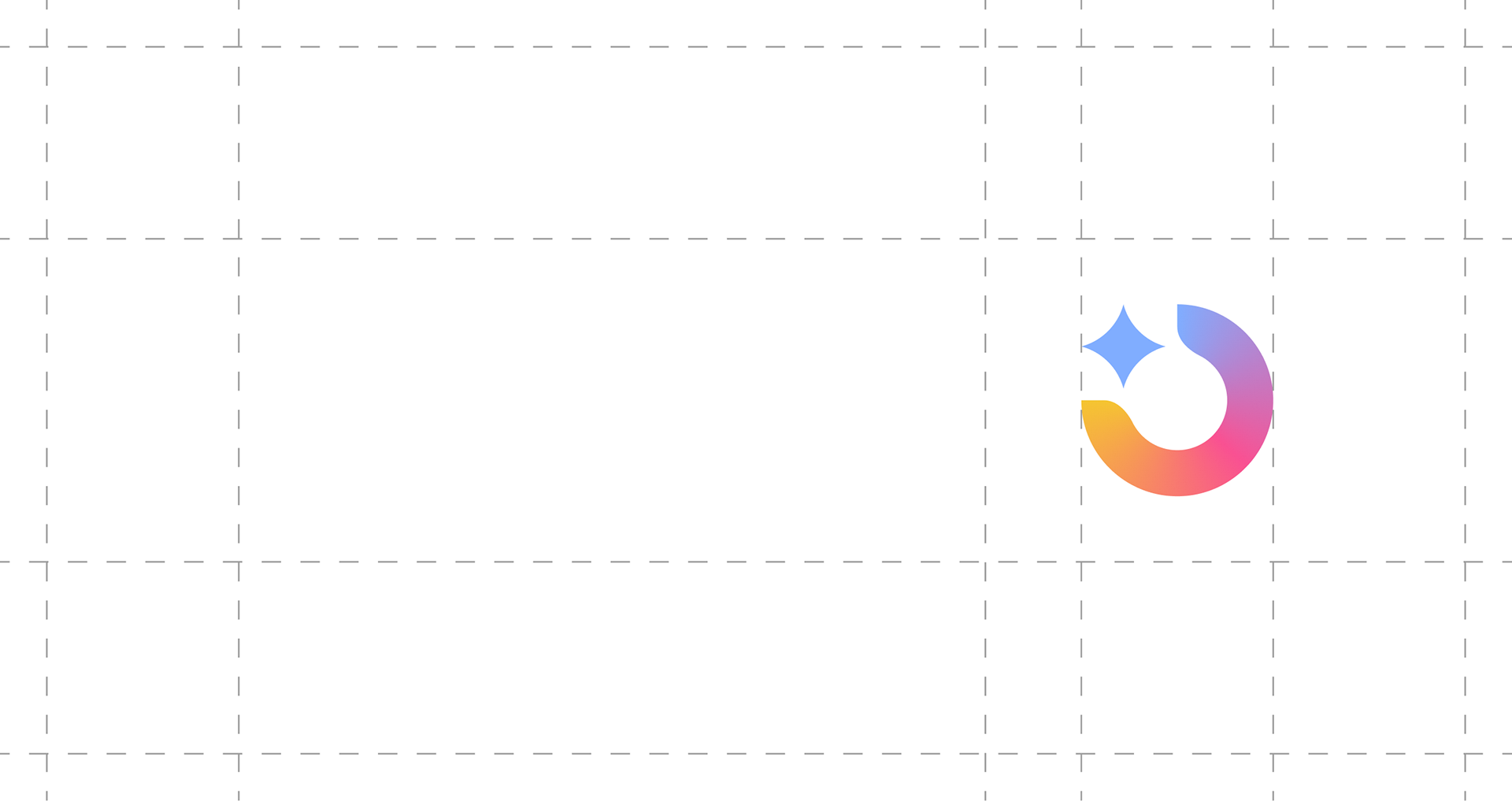
AI Functions
For the AI feature icon, I reimagined the brand’s main icon: the folded corner was replaced with a star, symbolizing innovation and technological progress. I also created a gradient based on the existing palette and introduced a new tone to highlight AI-related functionality within the brand system.


Illustrations
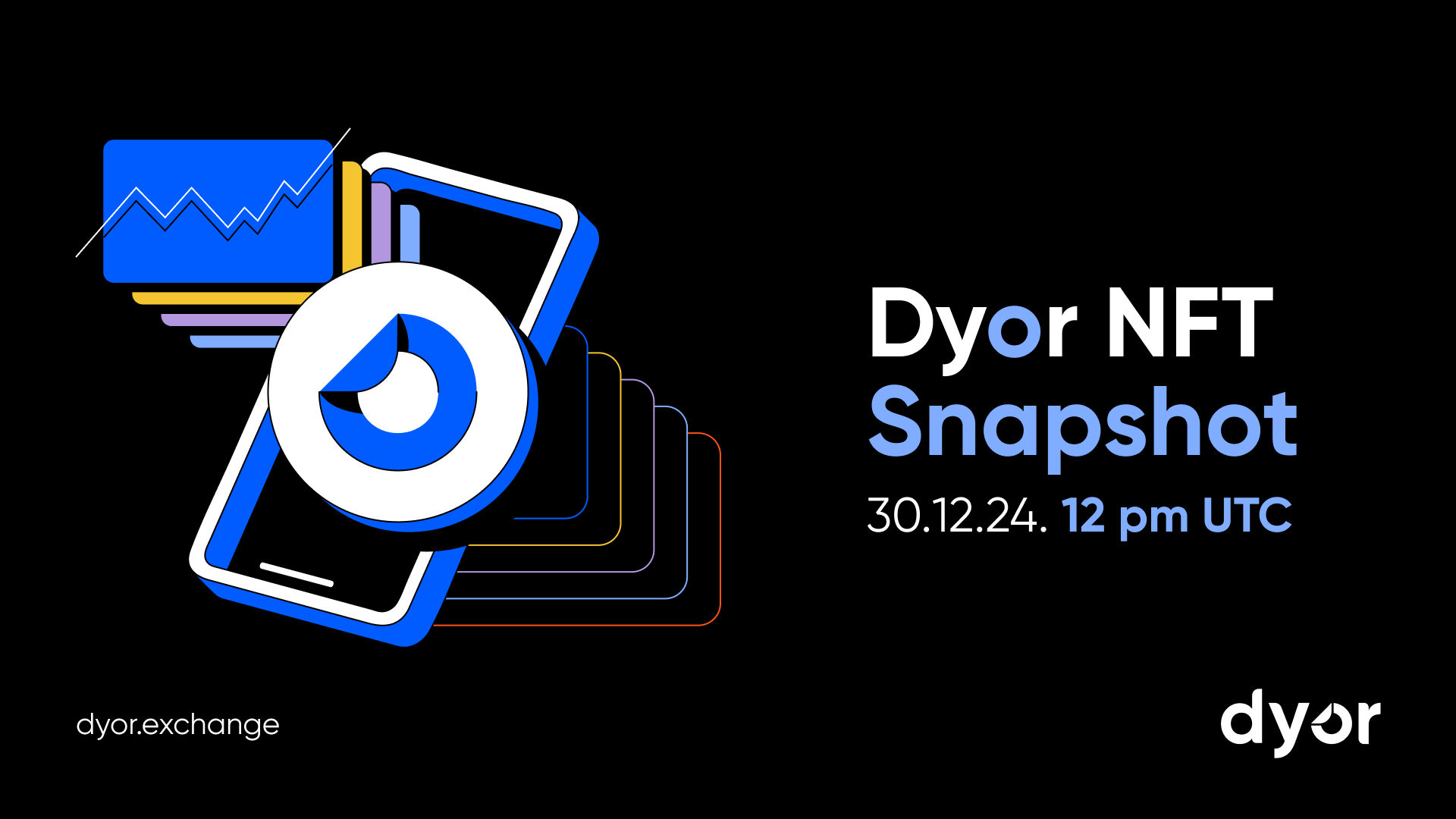
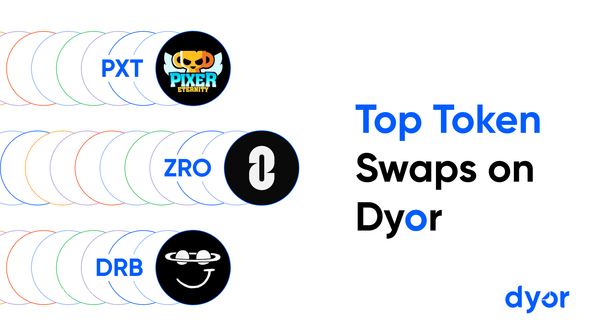
The illustration style was designed to align with the overall brand language: simple shapes, limited colors, clean lines, and high contrast. This ensures clarity, memorability, and instant recognition. The illustrations work seamlessly across product interfaces and promotional materials.